Canterbury
Help an old brand recapture its youth.
I was contracted by Pentland Brands to optimise the product taxonomy of the Canterbury website as part of a broader reassessment of the heritage rugby brand’s offering.
Concerns had also been raised about the efficacy of the existing structure, with a lot of poor metrics around product search.
My brief was to improve the experience for customers, making it easier for them to find what they were looking for - by means of naming, grouping and organisation.
OH YEAH, DAD WEARS THAT…
The challenge I was brought in to work on with the Pentland team, was to help recapture a younger market through a redesign of the product taxonomy.
A brand built on solid heritage and with a strong customer base in the 35+ age category, they were struggling in the youth market and wanted to recapture that “go to” position as rugby’s leading brand.
RESEARCH
First I had to pinpoint the problems with the existing setup. Early focus group and user interview data had highlighted a number of issues - mainly based around what younger customers called certain items and where they expected them to be in the site’s hierarchy.
TRIANGULATION
Using a combination of techniques, including link testing and naming questionnaires, I led my team to a series of discoveries.
Users were consistently navigating to the wrong areas when asked to find certain items. They were also unsure what some of these items even were, knowing them by other names.
We honed in on many new product names, finding patterns to users’ expectations, and teased out their mental models of optimal site structure by having them group items in the way they thought they should be.
A combination of quantitative and qualitative data was generated, raw stats along with talk-through video sessions of task completion for example - to triangulate the findings, giving far more insight than numeric metrics alone.
SORTED
My team and I then tested users to find out where they expected items to be. We used a card sort to let them name their own categories and group items in the way they would expect to find them.
This allowed us to work out the average user’s mental map of the product range and avoid using category titles or product groupings that didn’t make sense to them.
Image: Card sort similarity matrix
TESTING THE FINDINGS
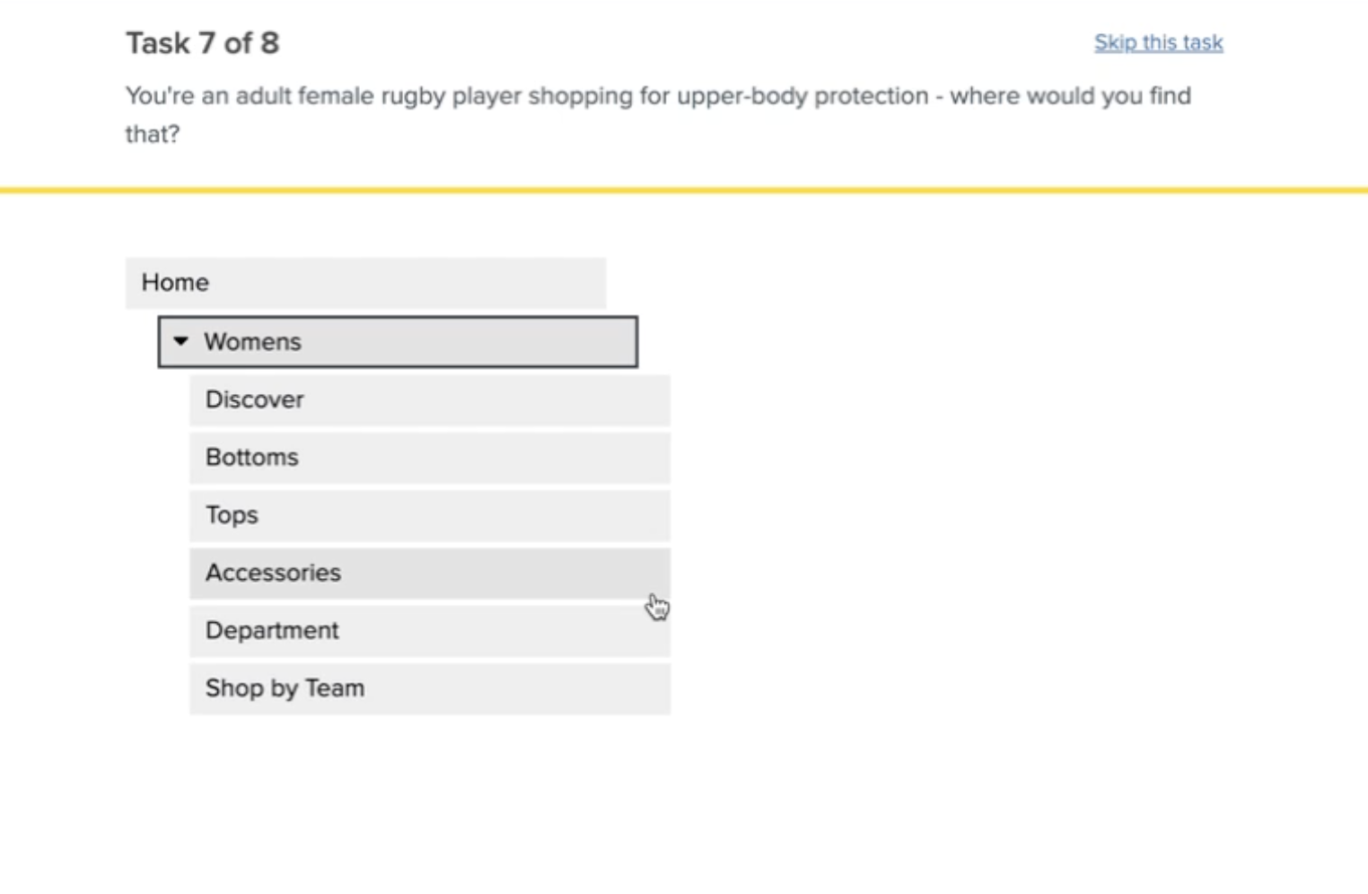
I then put this insight to the test, by constructing a new navigation based on the discoveries that were made and running it through remote video testing sessions.
We also fed in the anecdotal findings from the interviews, for example younger customers were more likely to go to Canterbury for protective gear and boots - so these were boosted in terms of their visibility in the taxonomy.
The changes marked a significant improvement on the initial link testing, with users far more able to ascertain what item were called and where they’d be likely to live in the product hierarchy.
After further iterations to iron out the remaining creases to the taxonomy, we had a really solid framework on which to build the new site.
“Alex joined us at Pentland Brands for several months to play the role of UX Architect on a series of complex projects.
He brought a great deal to the table in terms of his UX Design - detangling complex taxonomies and user journeys whilst navigating multiple different departments and educating the wider business on the importance of these.
He was brilliant at managing the team and at work scheduling, whilst also handling unexpected changes with calmness and ease.”
— Esther Moss, Senior Experience Manager, Pentland Brands.


