Bupa
On course for a better you
I was asked to design a product that would work in conjunction with a mental health course that Bupa run. The intention was for it to be a resource that users could either engage with after completing the course, or as a way of taking a digital version of the course.
After completing the course its key use would be as a dashboard to keep track of key mental health markers, offering guidance and suggestions if things weren’t going well.
CONCEPTUAL THINKING
Things kicked off with an initial playback of the brief and a run through of the discovery phase work done to date. We did some benchmarking on other wellbeing apps, as well as other sites that used mechanics we felt could be applicable to our usecase.
The initial brief allowed for quite a broad approach, the client was quite happy for us to run with some slightly more left-field concepts and didn’t mind the Bupa brand taking a back seat to our app design’s own proposed identity.
NORTHSTAR
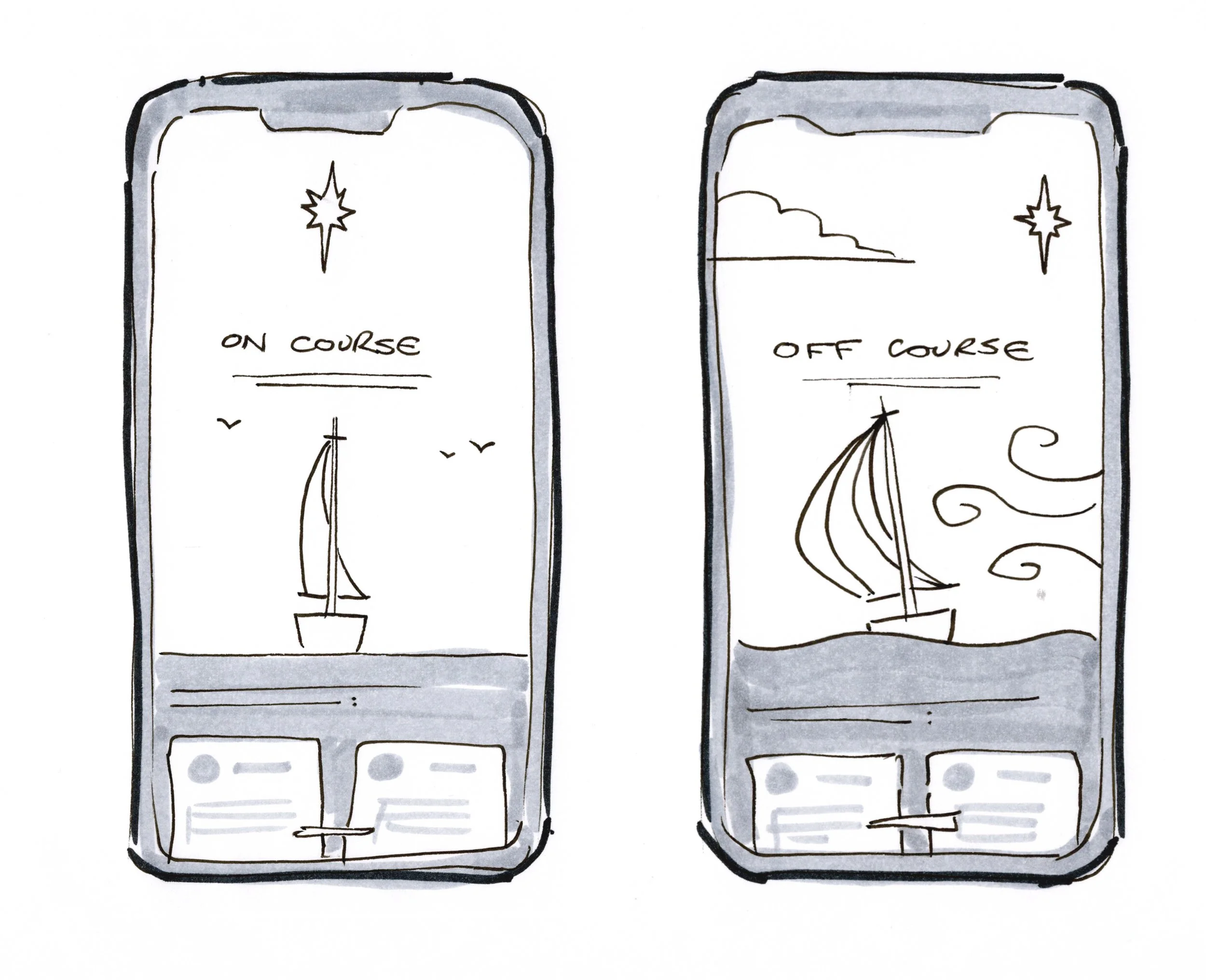
One highly conceptual idea for the app was based on that of “maintaining course”. Using a sea journey as a metaphor for the user’s mental state gave many useful parallels and provided a strong visual language, as well as tapping into something very emotive.
The user would input on the first screen how on-course or off-course they felt and that would have a real-time effect on the scene shown in the animated illustration. Inputting as on-course would show a calm sea, a stable boat and the northstar in the centre of the sky. Moving the slider into the off course area would move the “northstar'“ off to the side, with the weather and sea conditions becoming worse.
The hope was to visually capture the feeling of things becoming less manageable or more turbulent, making the app more engaging for users and hopefully seeing them return more often to take on the ideas it gave for helping problem areas.
ARC
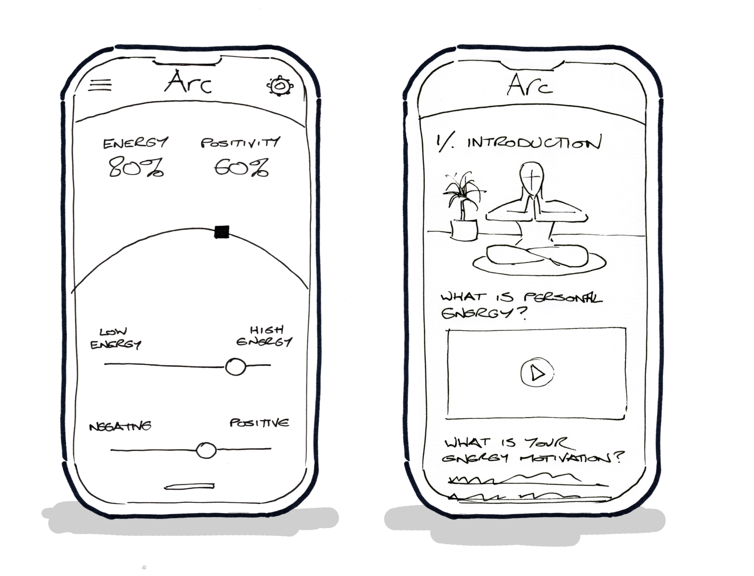
This concept relied on the simplicity of an arc as the core visual of the piece. The energy slider would increase the amplitude of the arc, and the positivity slider would move it from left to right with an accompanying change in the colour to help illustrate the user’s mood.
OTHER CONCEPTS
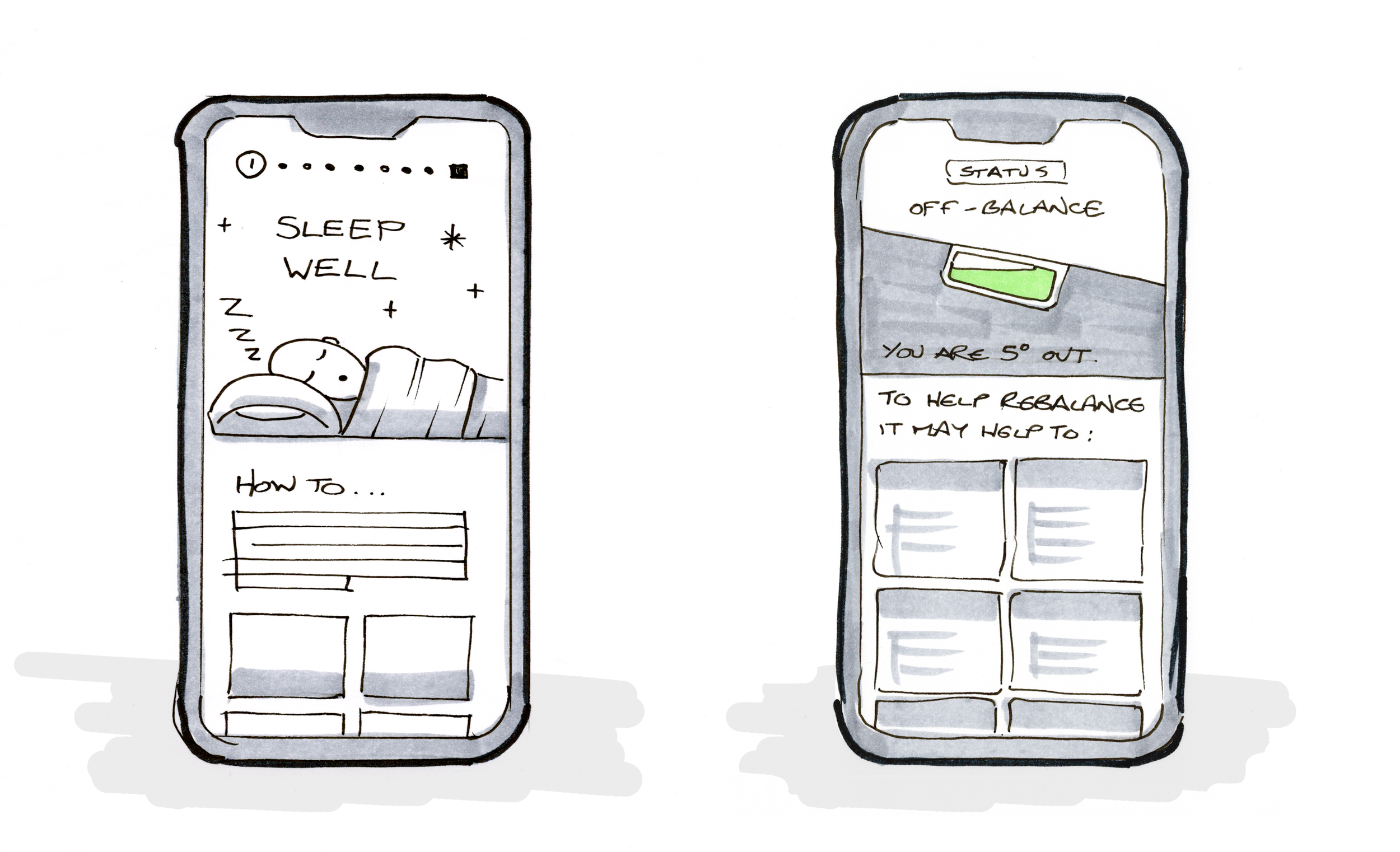
Several other concept approaches were explored, looking at themes including balance / equilibrium, sleep quality and wayfinding / direction.
Whilst interesting to develop and helpful in informing the onward coalescence of the project, none of these had the requisite combination of qualities required to serve as the optimal vehicle for the app.
PERSONAL ENERGY
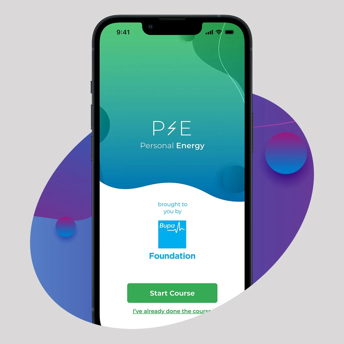
Eventually the options were whittled down and although the Northstar concept was seriously considered, the client did perhaps unsurprisingly opt for more a slightly more conventional option.
The Personal Energy route drew on many of the elements developed in other previous concepts however, so was in part an amalgam of other ideas - no work wasted here!
TESTING
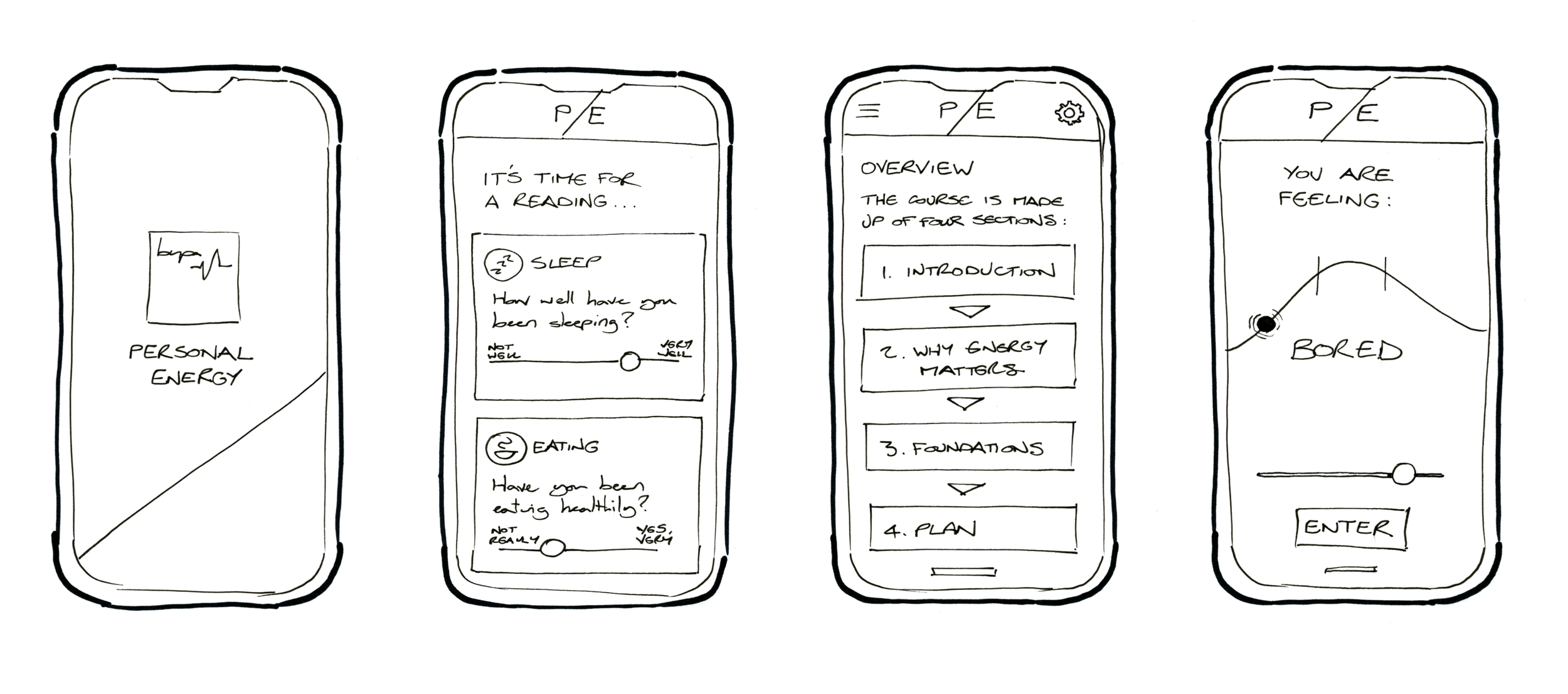
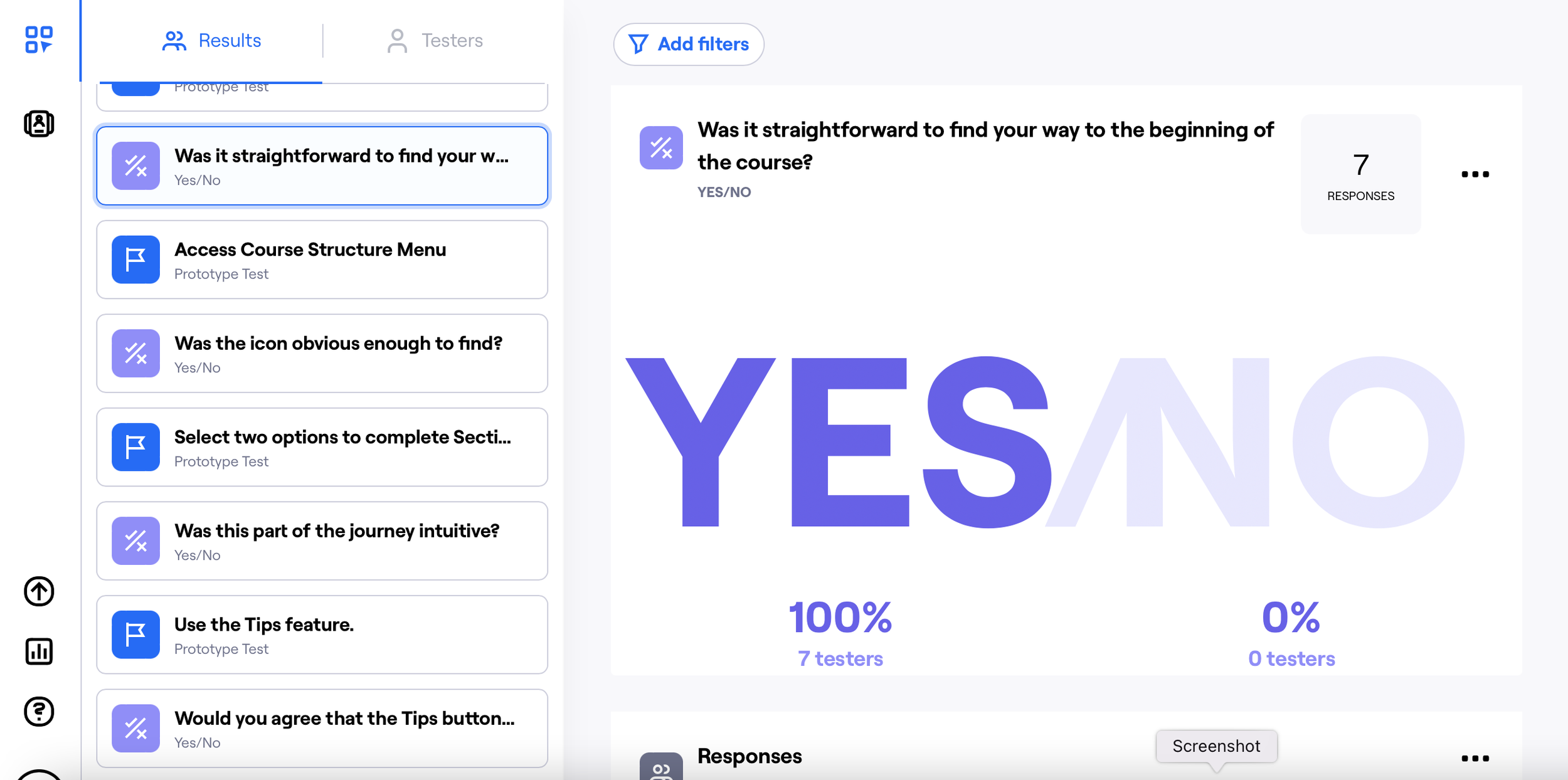
Once the wireframe was in a good place, I started preparing the groundwork for user testing. Using Maze, I constructed a number of tasks for users to complete based around key areas that I wanted to collect data on. At the first stage there were some valuable insights to pick up, including around accessing the course structure menu.
Several rounds of testing and design iteration moved the wireframe to a place where I felt we could take things to a higher fidelity.
THE RIGHT FEELING
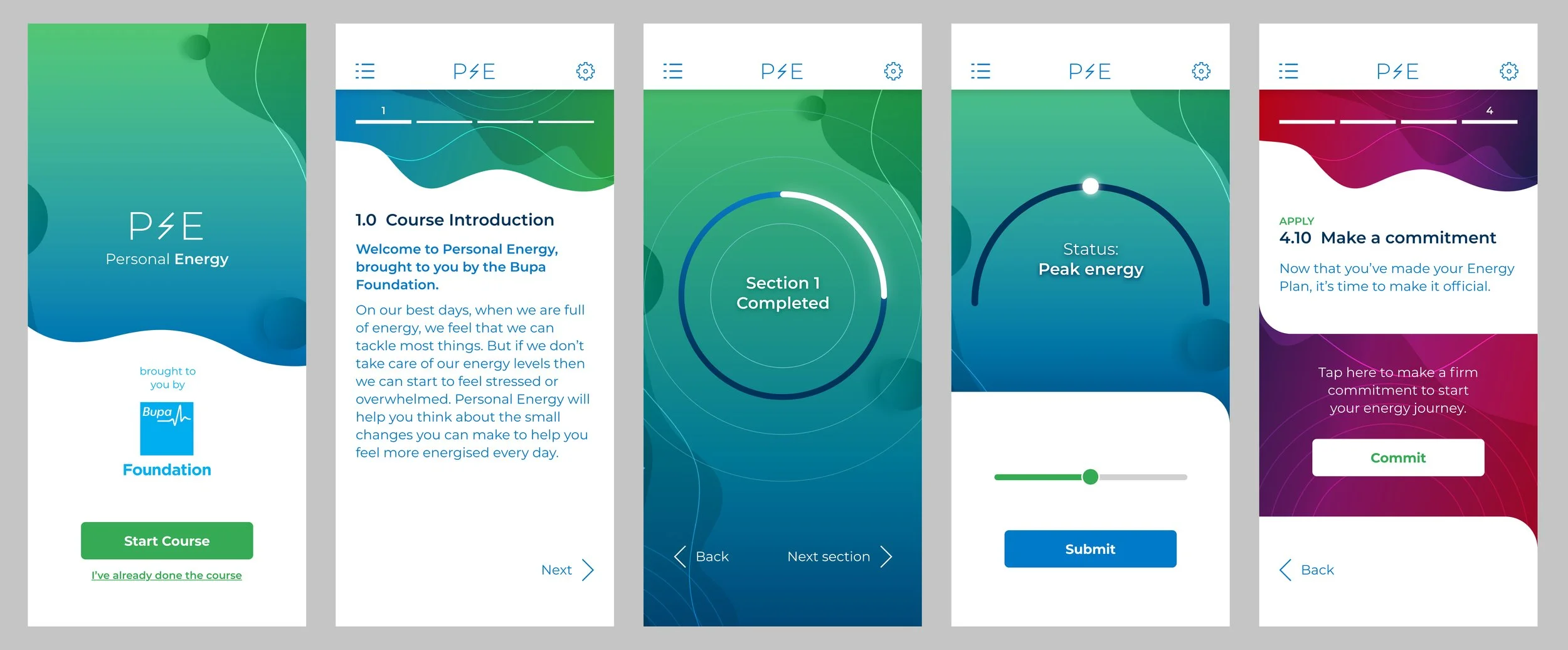
High fidelity designs came with the usual challenges of getting the right look and feel, but with this app the “feel” part of that had a specific gravity of its own. The user had to feel at ease using the app and it had to convey the right impressions in dealing with a topic as sensitive as mental health.
I worked up some moodboards for how I thought we could approach the designs - lots of organic forms, some textured materials, things that would feel calming but with some vibrance, to try and hit the app’s energy sweet spot between it’s own input extremes of “bored” or “overwhelmed”. After some rounds of consultation with the team and Bupa stakeholders, we arrived at a way forward and I began injecting the agreed style into higher fidelity designs used ultimately for further testing.
CONCEPT PROVED
With later stage testing ironing out the smaller issues, it was a matter of finessing the design with my UI hat on - ably assisted by the junior design staff on my team. The designs were recieved very warmly by the Bupa stakeholders - a vision that they could buy into and take to further developmental stages.
“Alex is a joy to work with - bringing calm, good humour and intellect to any brief. We spent a large amount of lockdown attempting to keep each other sane from our home offices as we worked, ironically, on a concept for a Bupa mental health and wellbeing app!
A double-bubble bonus is that - as well as flawless UX/UI - he can produce gorgeous scamps that succeed in both bringing an idea to life and fluttering my nostalgic heart.”
— Nicola Fish, Strategy Director, 7Dots
